")
What Does Your Tube Color Say About Your Brand?
When it comes to skincare packaging, color is more than decoration — it’s strategy.
In a glance, the color of your face cream tube can shape how your product is perceived: clean or luxurious, clinical or calming, youthful or premium. And in today’s oversaturated beauty market, that impression can be the difference between a sale and a scroll-past.
So, what is your tube color saying about you?
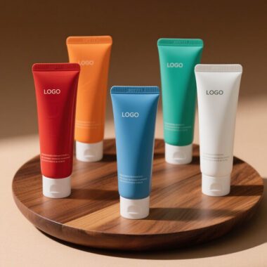
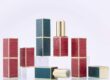
🎨 1. Color as a Language — and a First Impression
Before customers read your label or feel your formula, they see your packaging. Color sets the tone. It’s emotional. It’s cultural. And it speaks fast.
🌿 Green suggests natural, organic, or plant-based skincare
💧 Blue conveys hydration, cleanliness, and science-backed formulas
⚪ White signals purity, minimalism, or dermatologist-tested solutions
✨ Gold & Metallics say luxury, prestige, or anti-aging focus
🌸 Pastels appeal to softness, femininity, and gentle skincare
🖤 Black brings boldness, modernity, or a unisex appeal
Every shade carries weight. The key is to make sure your color matches your message.
🧠 2. Color Builds Brand Recognition
Your tube color becomes part of your visual identity. Think about Glossier’s millennial pink or The Ordinary’s clean white aesthetic — instantly recognizable.
Custom tube colors let you:
🔁 Stay consistent across product lines
📸 Stand out on shelves and social media
🎯 Reinforce your brand personality without words
With the right hues, your packaging starts doing the brand storytelling for you.
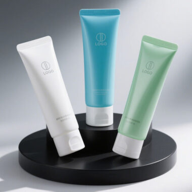
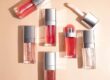
💡 3. Strategic Color Choices for Product Categories
Color can also help organize your product range. For example:
🌞 Yellow or orange for brightening or vitamin C products
🌙 Lavender or deep blue for night creams or calming formulas
🌹 Pink tones for sensitive or soothing skincare
🧪 White or silver for clinical or anti-aging treatments
When your color coding is consistent, customers intuitively know what they’re picking up — which builds trust and ease of use.
📦 4. Customization = Creative Control
With fully custom tube manufacturing, you’re not limited to standard color options. We offer:
🎨 Pantone color matching
🔄 Two-tone tube + cap combinations
🌈 Gradient effects, soft-touch finishes, metallic foils
🖼️ Full wrap graphics and printing
This allows you to build packaging that not only protects your product but embodies your brand’s tone and values — all the way from shelf to skincare routine.
🖐️ 5. Color + Texture = Total Brand Experience
Color catches the eye, but texture seals the deal. Combine color with:
Soft matte finishes for a premium feel
Glossy finishes for sleek, modern appeal
Embossed logos or metallic foil for luxury presence
Together, these elements turn your tube into a multi-sensory experience that reflects the quality inside.
🌎 6. Global Color Sensitivity Matters
Color isn’t universal — it’s cultural. For example:
🔴 Red = luck and celebration in Asia, but urgency or boldness in the West
⚫ Black = elegance in fashion, but sometimes avoidance in skincare
We help brands consider market context when choosing packaging colors — especially for global launches or region-specific product lines.
💬 Final Thought: Your Tube Color Is Your Brand Voice
If your product speaks through results, your packaging speaks through color. And in a crowded, design-savvy market, every visual detail matters.
So ask yourself:
🎯 Does your tube color reflect your target audience?
🌟 Does it create instant recognition on shelf or online?
💬 Does it say what you want your brand to say — without saying a word?
If not, let’s fix that. With fully customizable color options, expert guidance, and manufacturing flexibility, we help brands like yours build packaging that speaks clearly, confidently — and beautifully.
📩 Ready to make color work for your brand? Let’s create something unforgettable.